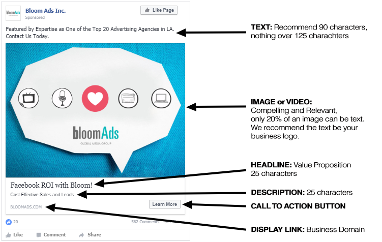
Is your brand active on social media? Facebook is more than just a platform for sharing with friends; it’s a way for companies to keep in touch with customers in real-time. Right now, Facebook ads are one of the best ways to reach consumers, especially since Facebook is actively deprioritizing organic business posts after the Cambridge Analytica scandal. With that in mind, not very many brands know how to make an effective Facebook ad. Facebook values user experience first, as this ensures that its users stay as active as possible. To protect this experience, Facebook prioritizes ads that appear like and don’t significantly interfere with the organic content users are consuming. This prioritization means that the ads you create need to be relevant and highly compelling. If you use visually stunning imagery and video, you’re more likely to catch a user’s attention, and users will be more likely to remember what they saw. Also, Facebook video ads, more than ever, are being treated more favorably by the Facebook ad prioritization algorithm. It All Starts with the ImageLet's start to outline precisely how to make an effective Facebook ad. As your intuition likely asserts, images and video are everything in Facebook ads. It only makes sense, then, that when making Facebooks ads you'd want to place your essential messages directly on the images and video. Perfect, sounds great right? Hold on, before you go loading up your Facebook ad image with copy, Facebook won’t allow your ad to garner impressions if the image has ad copy on it that takes up more than 20% of the image. Facebook has technology that scans the whole picture looking for numbers and letters, even if they are offers, logos, or slogans. So, use text carefully and cautiously in the image. The first step in learning how to make an effective Facebook ad is erring on the side of caution and sticking to short promotions or your logo. Next, Focus on the Ad CopyAlthough visuals are king in Facebook, it is vital to have clear, concise, and helpful ad copy in your ad to convey your message. Facebook ads offer three sections for your copy. There is the Text section above your image or video, which is where you can place the more extended portion of your ad copy. There is the Headline, which appears bold and larger right below your image or video. Finally, there is the News Feed Link Description under the Headline.

Text: Best PracticesThe first ad copy field that you can enter is the Text, which is where you will enter the bulk of your message. We recommend saving your value proposition for your Headline, so this section should support your value proposition. How does your offer work? What exactly separates you from your competitors? How can people take advantage of your products or services? You can put quite a bit of copy here, but eventually, Facebook will cut it off. When Facebook users are scrolling through their news feed, they won't stop to read a ton of text, especially if they need to click to expand the remainder. Our recommendation is to use at least 90 characters, but not to exceed around 125 characters. Headline: Best PracticesThe Headline is right below your image or video and, in our opinion, is the most crucial piece of text. It is a slightly larger font than the rest of the ad copy, and it is also bolded. Due to it being more prominent than any of the rest of your ad copy, it should be the most critical part of your message. We recommend placing your value proposition here. The value proposition is an assurance of value to your customers. It should be a differentiator from your competitors. It can be an offer or a promotion or can state why your product or service is the best. The Headline can be 40 characters, but we recommend limiting it to 25 characters so they aren't cut off in mobile ads. This means you'll need to pack your punch in a small message. News Feed Link Description: Best PracticesAfter the Headline is the News Feed Link Description. We recommend using this to offer supporting information to your Headline. Users are likely to see the Headline and then scan the News Feed Link Description right after. You can likely place your best two bullet points in this space. We recommend 25 characters here as well and keep in mind that this text field will not show in your mobile ads. Carousel Ads for Direct Response CampaignsWe've discussed standard image and video ads, but we've also found that Facebook Carousel Ads work well for direct response campaigns. Carousel ads highlight up to five different products or services that your prospects can individually click on to learn more about each. Each of the five options can have a distinct click-through URL, giving your customers more options and more opportunities to convert. The standard Facebook ad best practices outlined above still apply, but carousel ads offer marketers more creative options.

We Know How to Make an Effective Facebook AdWant more info? Contact our full-service digital advertising agency to learn more about how we can help you improve your brand’s social presence through social media advertising.Call us at 818-703-0218 to speak with a digital marketing expert directly or visit our website to learn more about our digital services.